Project Overview
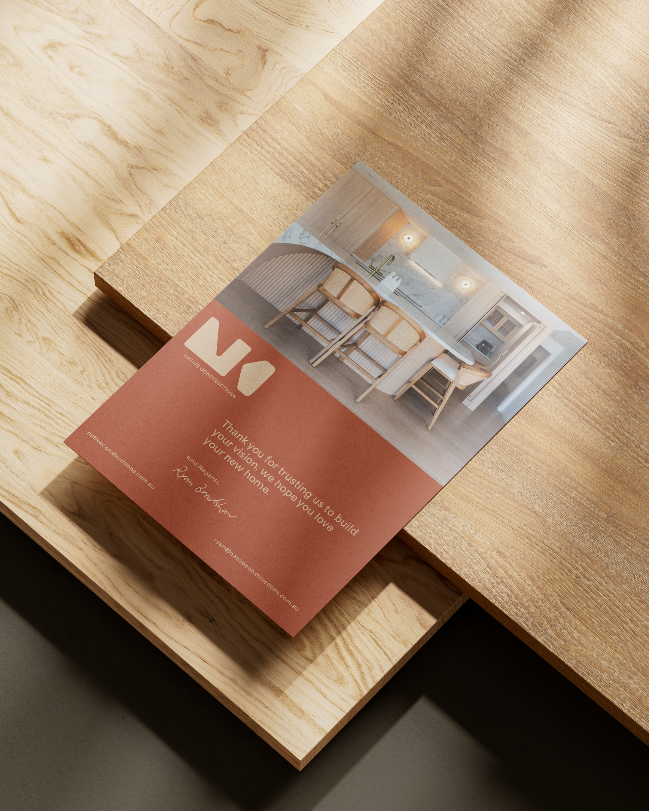
Native Constructions required a complete brand evolution to align their visual identity with their high-end residential projects. The goal was to shift away from a traditional "trade" aesthetic toward a sophisticated, architectural identity that reflects structural strength and premium craftsmanship.
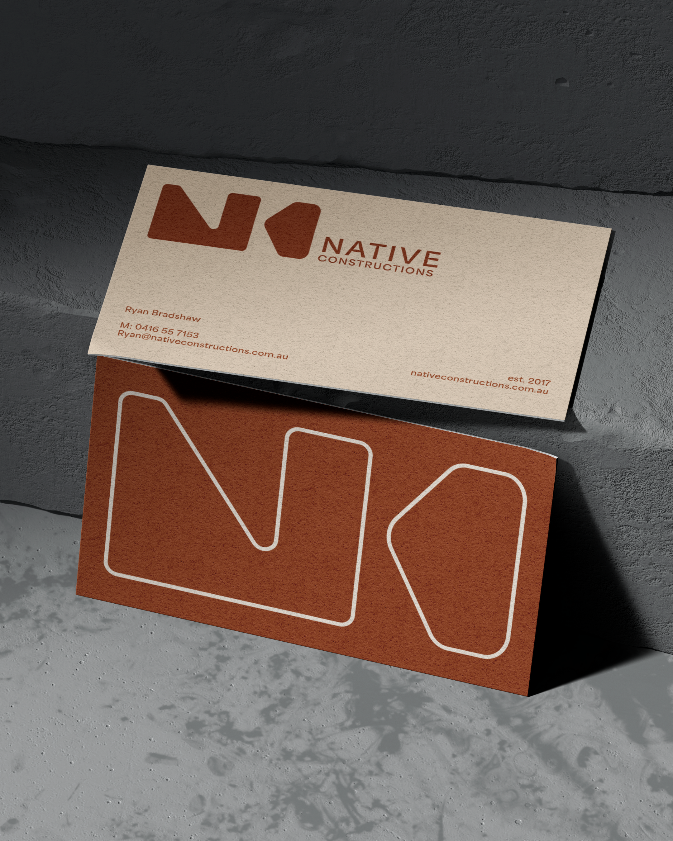
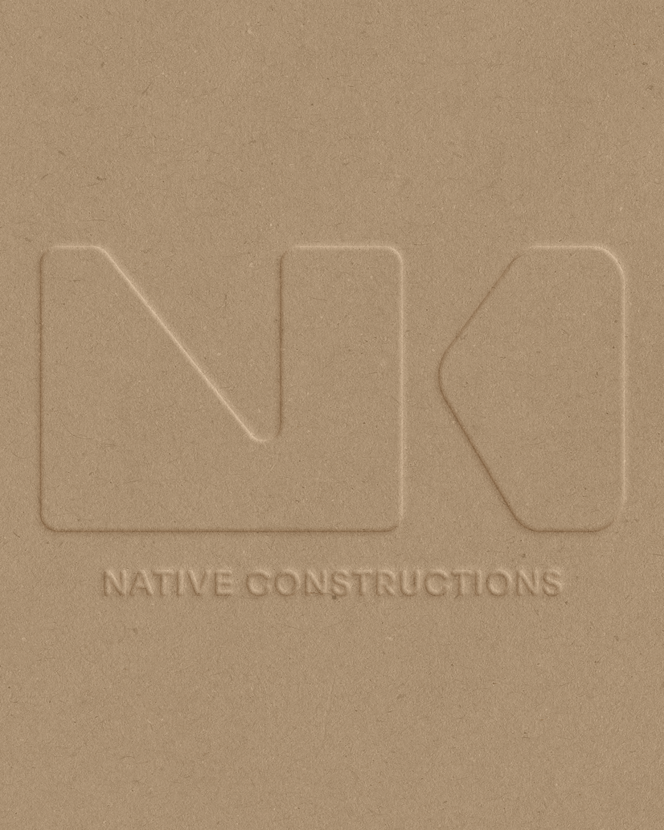
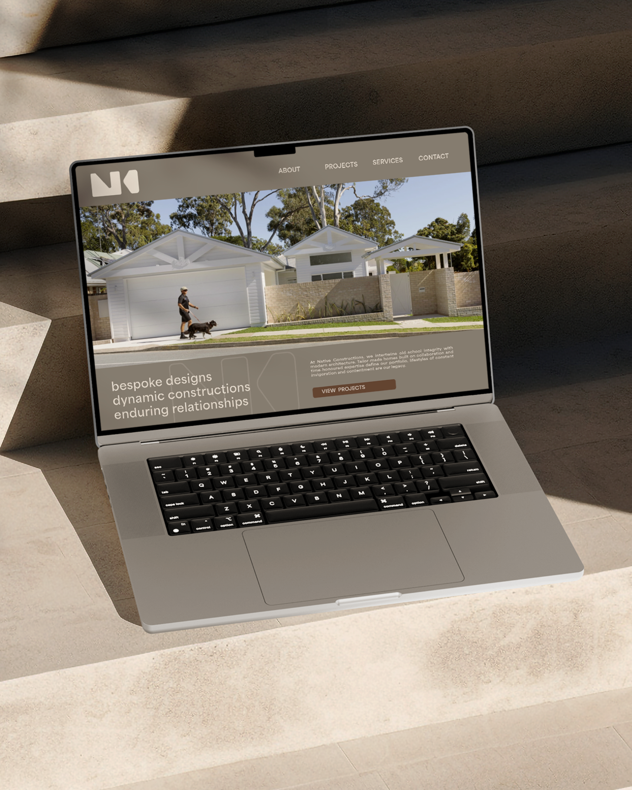
The creative direction was centered on Brutalist minimalism and geometric precision. By moving away from literal construction icons, we developed a brand system that feels monolithic and grounded. The focus was on creating a "Hero" brand mark that commands attention while maintaining the clean, spacious feel of a modern design studio.
-
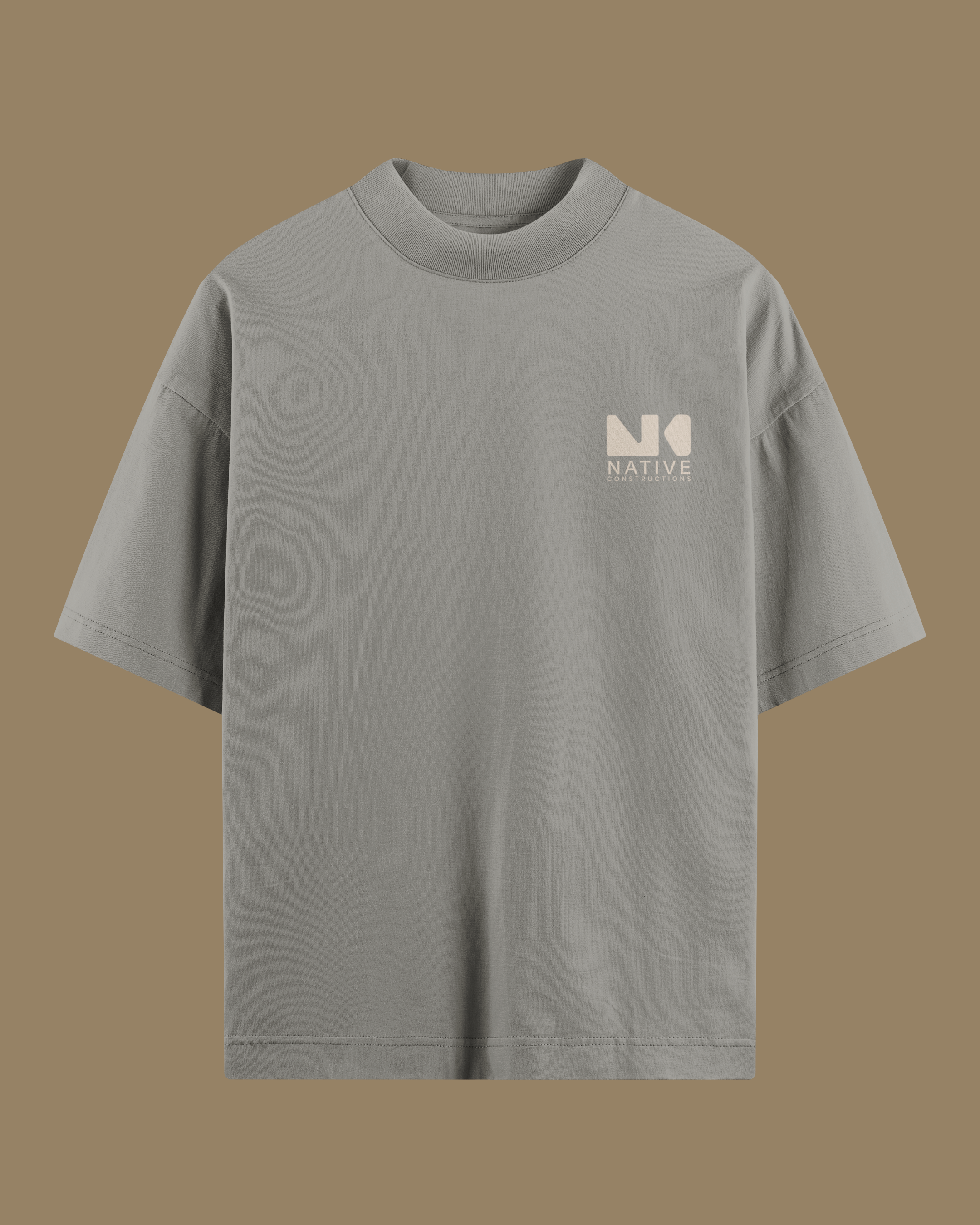
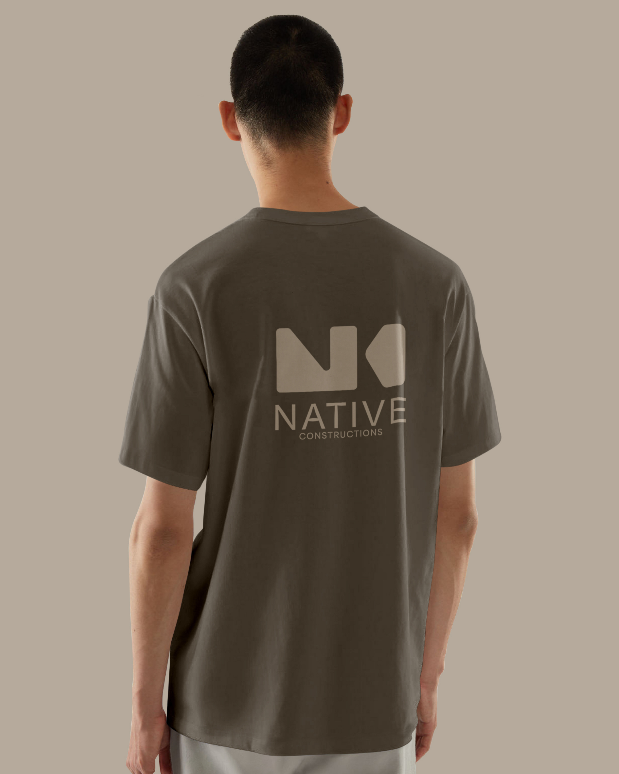
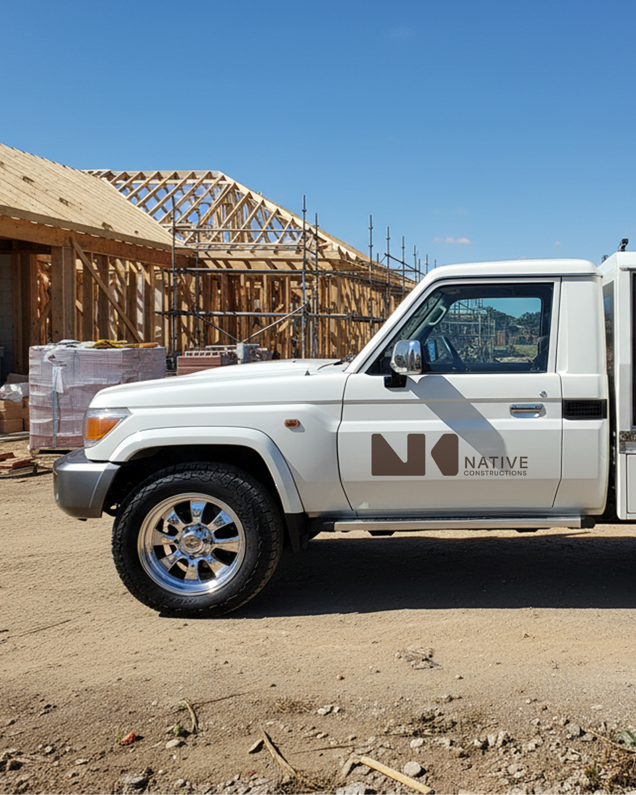
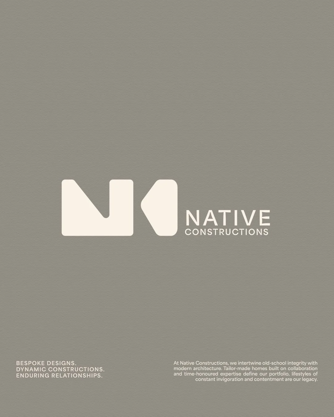
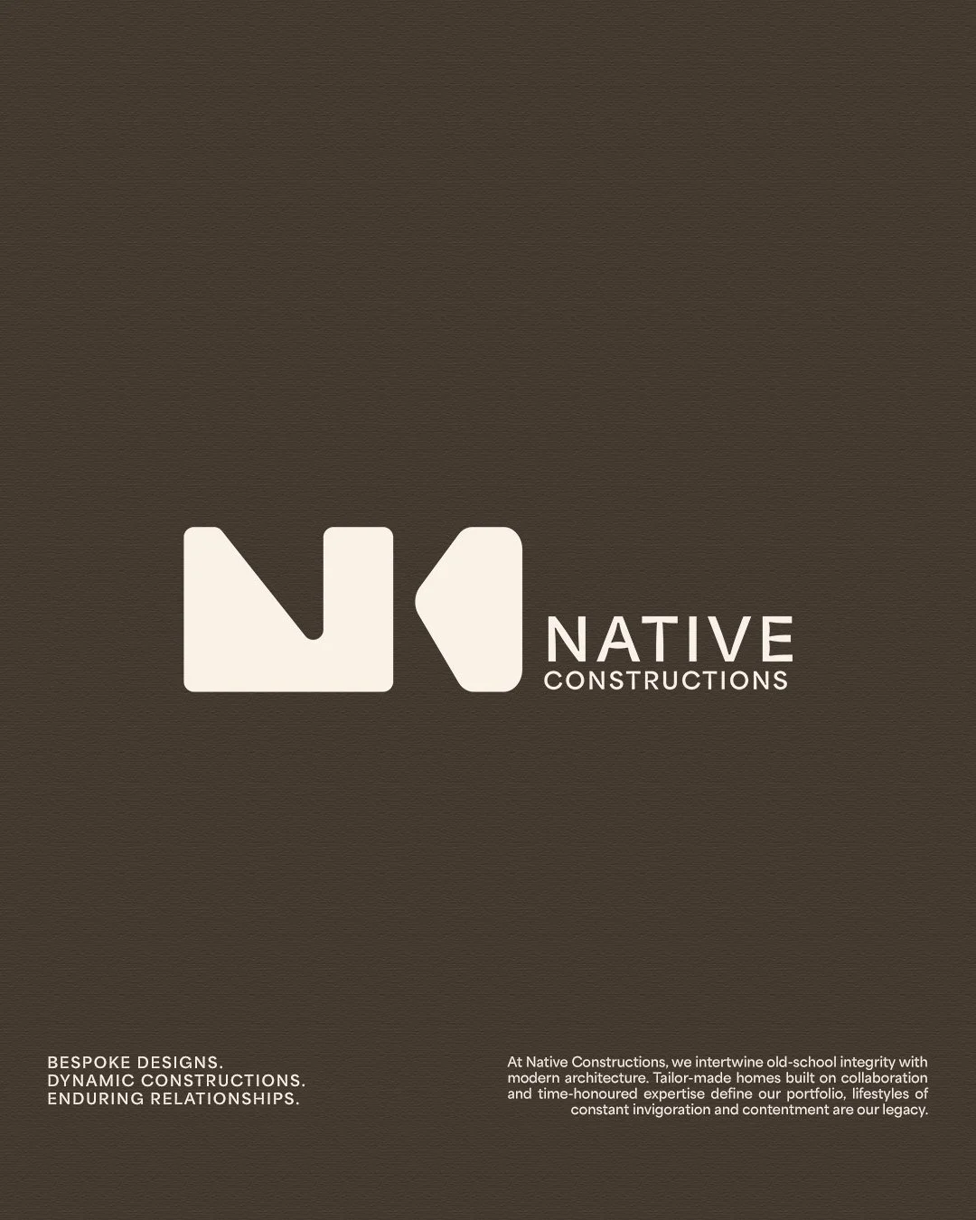
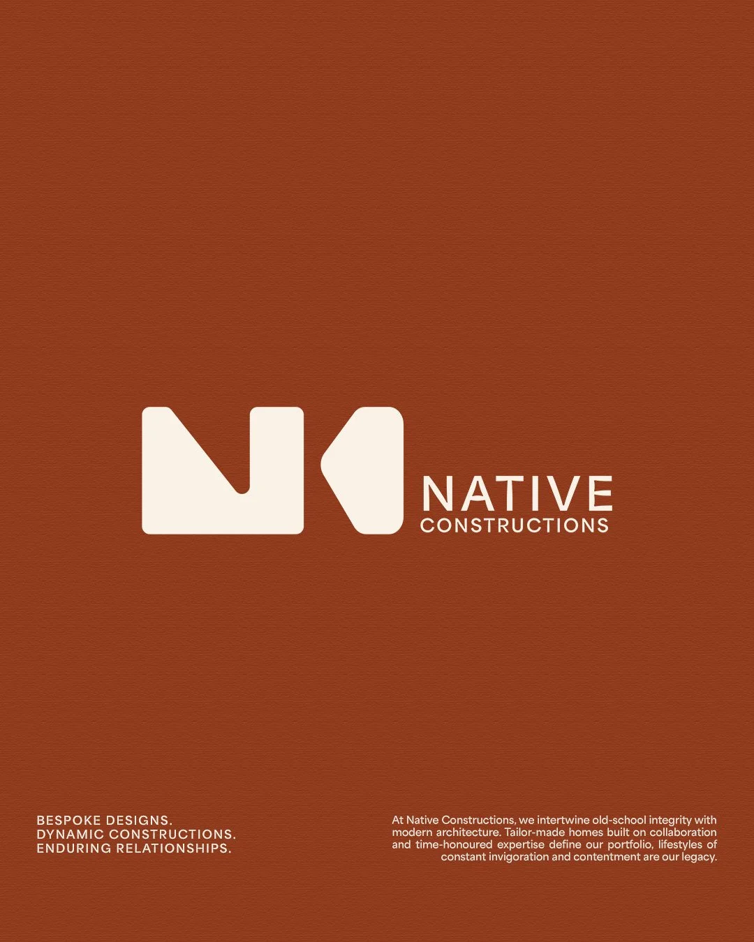
Logo Design & Icon Design
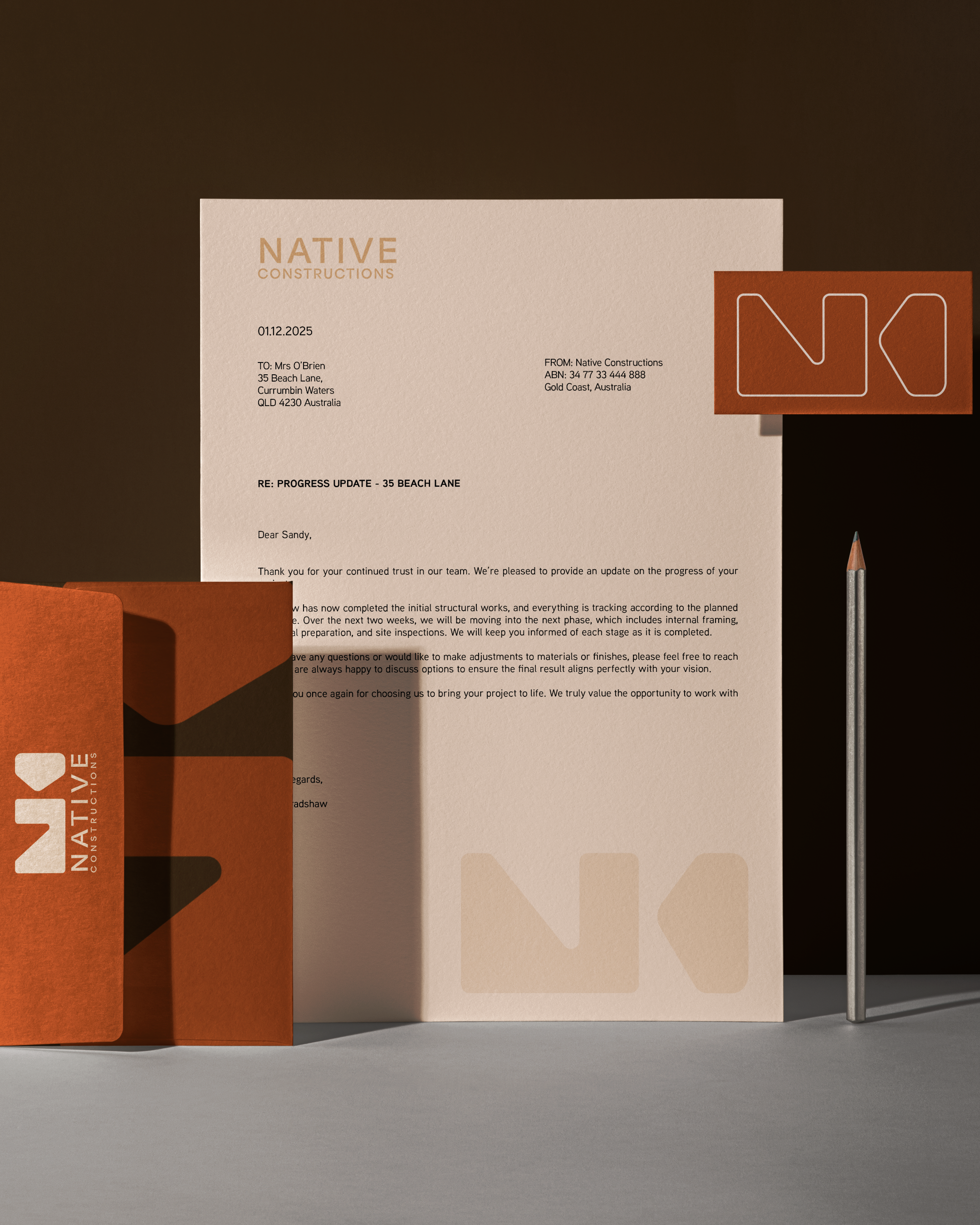
Brand Guidelines
-